
Make the everyday feel considered.
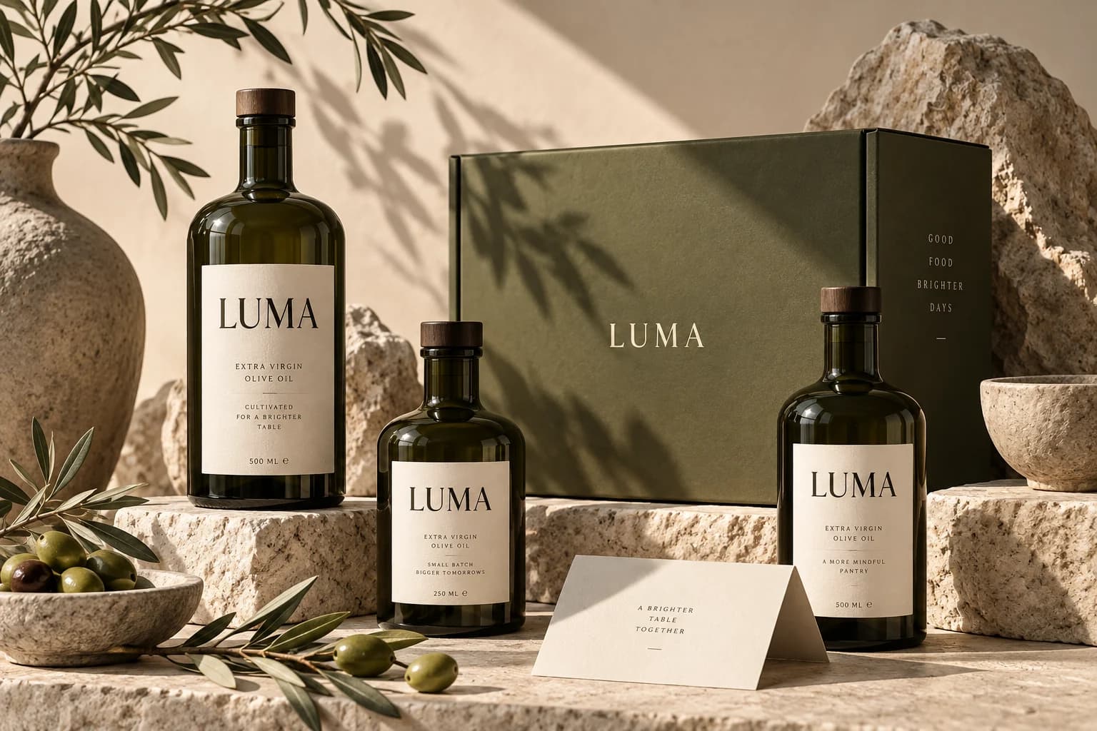
Olive tones, quiet typography, and tactile materials give familiar essentials a distinctive presence. The identity is designed to feel at home on a kitchen shelf and on a screen.
Everyday essentials. An uncommon experience.
Make a pantry subscription feel personal, useful, and easy to understand.
[1] The starting point
The idea starts with a familiar ritual: bringing good food to the table. This exploration imagines a pantry brand where the quality of the ingredients and the care of the experience feel equally important.
A tactile identity gives the brand warmth. The proposed digital direction carries that feeling into a storefront built around clear product stories, useful choices, and an understandable subscription.
The direction
A warmer brand story, a curated storefront, and a simple path from discovery to subscription.
[2] On the drawing board
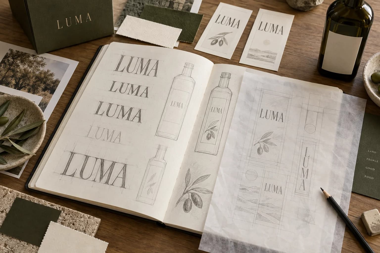
Sketches, structure, and a possible way forward. A closer look at the ideas behind this concept.
01 / Exploring the identity
Letterforms, label proportions, and material choices explored together. This imagined sketchbook brings the identity back to the table, before the final packaging.
AI-generated process study · Identity / packaging / commerce
02 / Building the experience
A storefront study that puts the product, the delivery rhythm, and the next step in one view. The visual warmth carries through; the choices stay practical.
[3] The development notebook
A look beneath the finished surface: proposed journeys, small visual systems, and the questions that would guide the next iteration.
01 / Structure before styling
Before choosing a typeface or a bottle label, the storefront needs to answer three questions: what is in the box, does it fit my routine, and what am I committing to? These wireframes explore that sequence.
Lead with the ingredients. A subscription is easier to understand once the products have earned some interest.
Keep the contents and delivery rhythm in the same step. Avoid making people commit before they can see what they are choosing.
Recap the contents and recurring delivery before checkout. Pricing and cancellation terms would be explicit in a working version.
Low-fidelity concept wireframes · Illustrative content · Proposed journey
02 / A system in the details
A label, an insert, and a small product card use the same ingredients: olive ink, generous margins, and a quiet serif voice. The materials make the brand tactile; the hierarchy keeps it useful.
Keep the product name, origin, and quantity in a consistent order. The identity should still work when the range grows beyond one bottle.
A short pantry note makes space for provenance and ways to use the ingredients. It extends the story beyond the moment of purchase.
[4] Inside the thinking
Olive tones, quiet typography, and tactile materials give familiar essentials a distinctive presence. The identity is designed to feel at home on a kitchen shelf and on a screen.
The proposed storefront puts ingredients, provenance, and practical details close to the decision. A curated structure would help people find what fits their routine.
The subscription direction centres on explaining what arrives, how often, and what can change. The aim is to make a recurring purchase feel like an informed choice.
Keep exploring
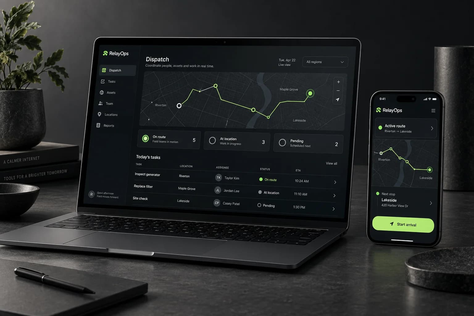
RelayOps
Product design / Web design