
Make priorities visible.
A restrained interface uses hierarchy, spacing, and a small accent palette to distinguish the important action from supporting information. The concept keeps the overview calm even when the work is busy.
Less friction. More forward motion.
Connect dispatch teams and field workers without adding another layer of complexity.
[1] The starting point
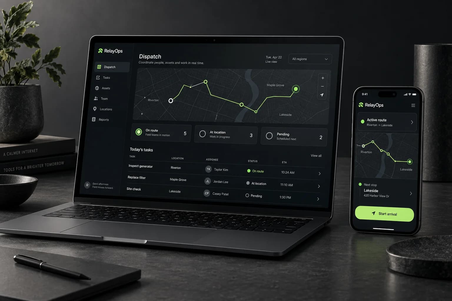
Dispatch work involves moving information as well as people. This concept explores how a shared product language could help an office team and a person in the field understand the same situation without seeing the same screen.
The direction separates overview from action. A desktop workspace makes status and priorities easier to scan, while the mobile experience focuses on the immediate task and the information needed to move it forward.
The direction
One product language across the dashboard, mobile workflows, and the story that brings it to market.
[2] On the drawing board
Sketches, structure, and a possible way forward. A closer look at the ideas behind this concept.
01 / Mapping the flow
An exploratory wireframe board separates the office overview from the field task. The arrows connect a shared workflow, while the screens give each person a different level of detail.
Illustrated concept study · Task flows / wireframes / interface
02 / Building the experience
A component and layout study for dispatch and mobile. Shared statuses, a calm overview, and a focused task card make the relationship between the two screens visible.
[3] The development notebook
A look beneath the finished surface: proposed journeys, small visual systems, and the questions that would guide the next iteration.
01 / Structure before styling
A dispatcher needs to see the whole day. A person in the field needs to know what happens next. This proposed handoff maps how a task moves between those two views without losing its context.
Surface the exception first. The map supplies location, while the task list explains what needs a decision.
Keep the route, availability, and assignment together. Show the impact of a choice before asking for confirmation.
Give the field view one primary action. Keep support close by for the moments when the real world does not follow the plan.
Low-fidelity concept wireframes · Illustrative content · Proposed journey
02 / A system in the details
A status vocabulary, a task card, and an activity trail form a small interface kit. Each state has a written label and a distinct symbol, so colour is never the only way to understand the work.
Unassigned, in progress, and complete should mean the same thing on the office dashboard and the field screen. A task changes state; its identity stays consistent.
The proposed system keeps a visible place for issues and reassignment. A polished happy path is only one part of an operational product.
[4] Inside the thinking
A restrained interface uses hierarchy, spacing, and a small accent palette to distinguish the important action from supporting information. The concept keeps the overview calm even when the work is busy.
The dashboard supports coordination. The mobile direction supports action in the field. Shared terminology connects them, while the layout responds to what each person needs to do.
Consistent status patterns and reusable interface components form the proposed foundation. New workflows could build on familiar behaviour rather than introducing a different system each time.
Keep exploring
Forma House
Art direction / Digital design