
Start with the sense of place.
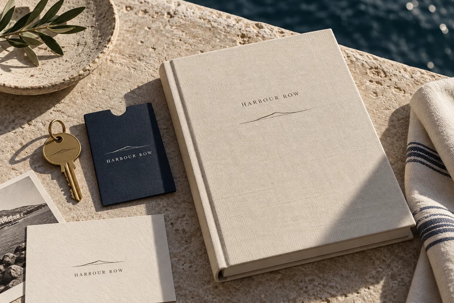
Warm stone, deep coastal tones, and understated stationery create a quiet identity. The concept treats small physical details as part of the same story as the digital first impression.
The experience starts before the arrival.
Bring the atmosphere of a physical space into a digital first impression.
[1] The starting point
A place has a character that a list of amenities can’t fully explain. Harbour Row explores how a boutique coastal stay could express its atmosphere through identity, print details, and an editorial digital experience.
The direction balances a sense of place with the clarity a guest needs. Tactile materials and understated typography set the tone; the proposed website gives rooms, local context, and reservation information a clear structure.
The direction
An editorial website that gives the place room to speak, with a clear route from curiosity to reservation.
[2] On the drawing board
Sketches, structure, and a possible way forward. A closer look at the ideas behind this concept.
01 / Exploring the identity
Horizon-line marks, serif proportions, and coastal material tones form an identity study. The direction looks for character in the small details, from a key sleeve to a page heading.
Illustrated concept study · Identity / materials / reservation
02 / Building the experience
An editorial room-page study balances the feeling of a stay with practical reservation information. Room details and availability belong close to each other.
[3] The development notebook
A look beneath the finished surface: proposed journeys, small visual systems, and the questions that would guide the next iteration.
01 / Structure before styling
A guest moves between imagining a stay and checking practical details. The proposed journey gives both needs a place, from a first glimpse of the coast to a clear reservation summary.
Let a strong image and a few considered words introduce the place. Keep the route to rooms visible without crowding the first impression.
Place the view, room capacity, and useful details beside the dates. Atmosphere should not require a separate search for essentials.
Bring the chosen room, stay dates, and conditions into one summary. A real booking flow would show the total before asking for payment.
Low-fidelity concept wireframes · Illustrative content · Proposed journey
02 / A system in the details
A horizon mark and a restrained serif wordmark sit across a room-key sleeve, a guest note, and a small editorial card. Coastal ink, linen, and stone keep the family connected without making every object identical.
A room key or welcome note is part of the arrival. The proposed print system uses simple proportions and quiet details that also translate to the website.
Editorial headings set the tone. Straightforward labels for room details and reservations keep the practical side easy to scan.
[4] Inside the thinking
Warm stone, deep coastal tones, and understated stationery create a quiet identity. The concept treats small physical details as part of the same story as the digital first impression.
An editorial layout would let photography and useful local context build a picture of the stay. The direction makes space for atmosphere while keeping important information easy to find.
Room choices and practical details would sit close to the booking decision. The aim is a smooth transition from imagining a visit to understanding how to arrange one.
Keep exploring
Luma Pantry
Brand identity / eCommerce